The Experiential Learning (EL) Platform is used across the University of Ottawa to manage co-op and internship workflows. While the backend was stable, the employer-facing interface had become outdated — cluttered layouts, inconsistent visuals, and limited responsiveness made essential tasks harder than they needed to be.
My responsibility was to design a modern employer portal and build a scalable design system that future teams could rely on — all within the limitations of MudBlazor, the component library used by developers.
Industry
Education
Timeline
6 months (while pursuing masters)
My Role
UX Research, Information Architecture, Interaction Design, Visual Design, Design System Creation

Disclaimer: All images related to this case study are copyrighted by the University of Ottawa.
The Experiential Learning (EL) platform at the University of Ottawa plays a critical role in connecting employers with students for co-op and internship opportunities. Employers use it to post jobs, review candidates, and submit evaluations — workflows that directly impact student placements.
While the system was functionally reliable, the interface had not evolved with user expectations. Over time, screens became cluttered, layouts inconsistent, and simple actions required too many steps. Employers often needed guidance just to complete basic tasks, and the experience felt more like navigating a legacy internal tool than a modern SaaS product.
When uOttawa IT decided to modernize the platform, they faced a key constraint: the backend was locked. Any improvement had to happen entirely on the frontend, using MudBlazor, a .NET-based component framework with limited visual flexibility.
That’s where my role began.
Instead of jumping straight into redesigning pages, I stepped back and focused on the foundation.
If this platform was going to evolve, it needed a design system that worked with the technical reality, not against it.
This wasn’t just a visual refresh.
We were trying to answer a deeper question:
How do you modernize a legacy enterprise system without breaking it — and without creating more inconsistency for future teams?
From both user and team perspectives, the pain points were clear:
• Employers struggled to find and complete key actions efficiently
• Pages looked and behaved differently across the system
• There was no shared design language or reusable component set
• Accessibility standards weren’t consistently met
• Developers had no visual reference beyond default MudBlazor styles
The risk wasn’t only poor usability — it was long-term design debt.
Design System First
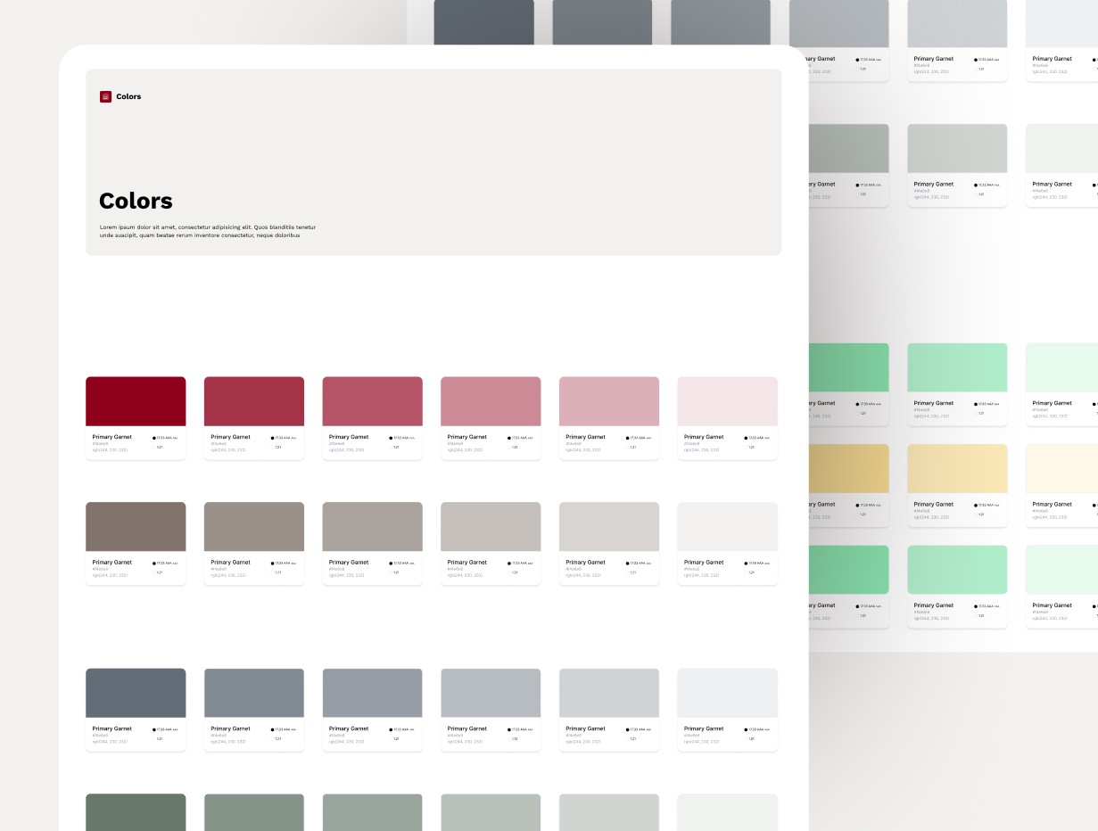
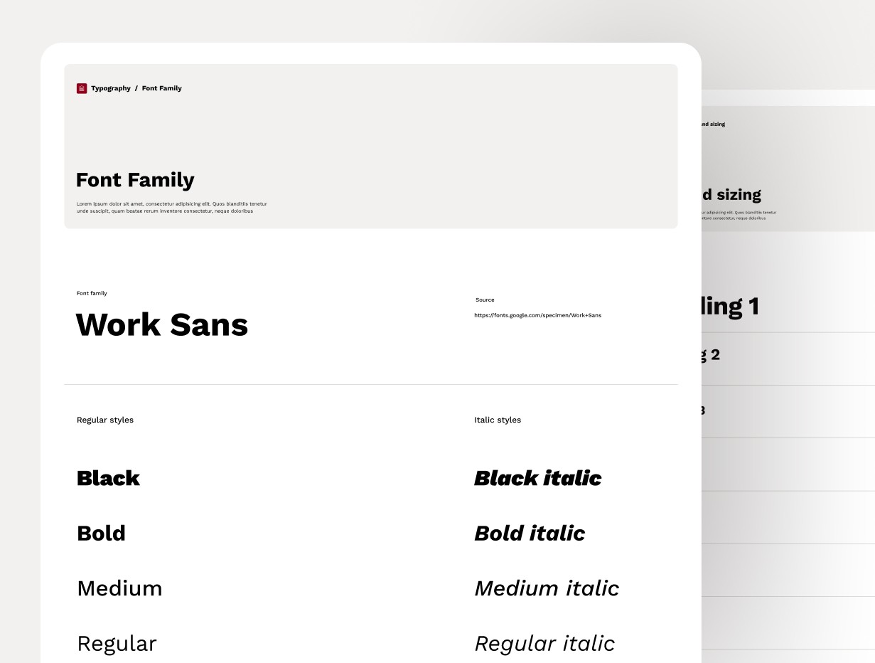
I started by auditing the existing interface and mapping what was currently in use to MudBlazor’s component structure. From there, I created a modular design system in Figma that defined:
• Typography aligned with uOttawa’s official brand, with clear hierarchy and scalable sizes
• Color roles derived from the university palette, assigned semantic meaning rather than decorative use
• Spacing and layout rules using an 8-point system that translated cleanly into code
• Iconography aligned with Material guidelines but visually tuned to feel academic and professional
This system became the single source of truth for design decisions.
Turning the System Into Real UI
Once the foundations were in place, I designed a complete set of reusable components — buttons, inputs, tables, dialogs, navigation elements — all structured to map directly to MudBlazor.
This step was critical.
Every component was designed not just for how it looked, but how it would be built and reused.
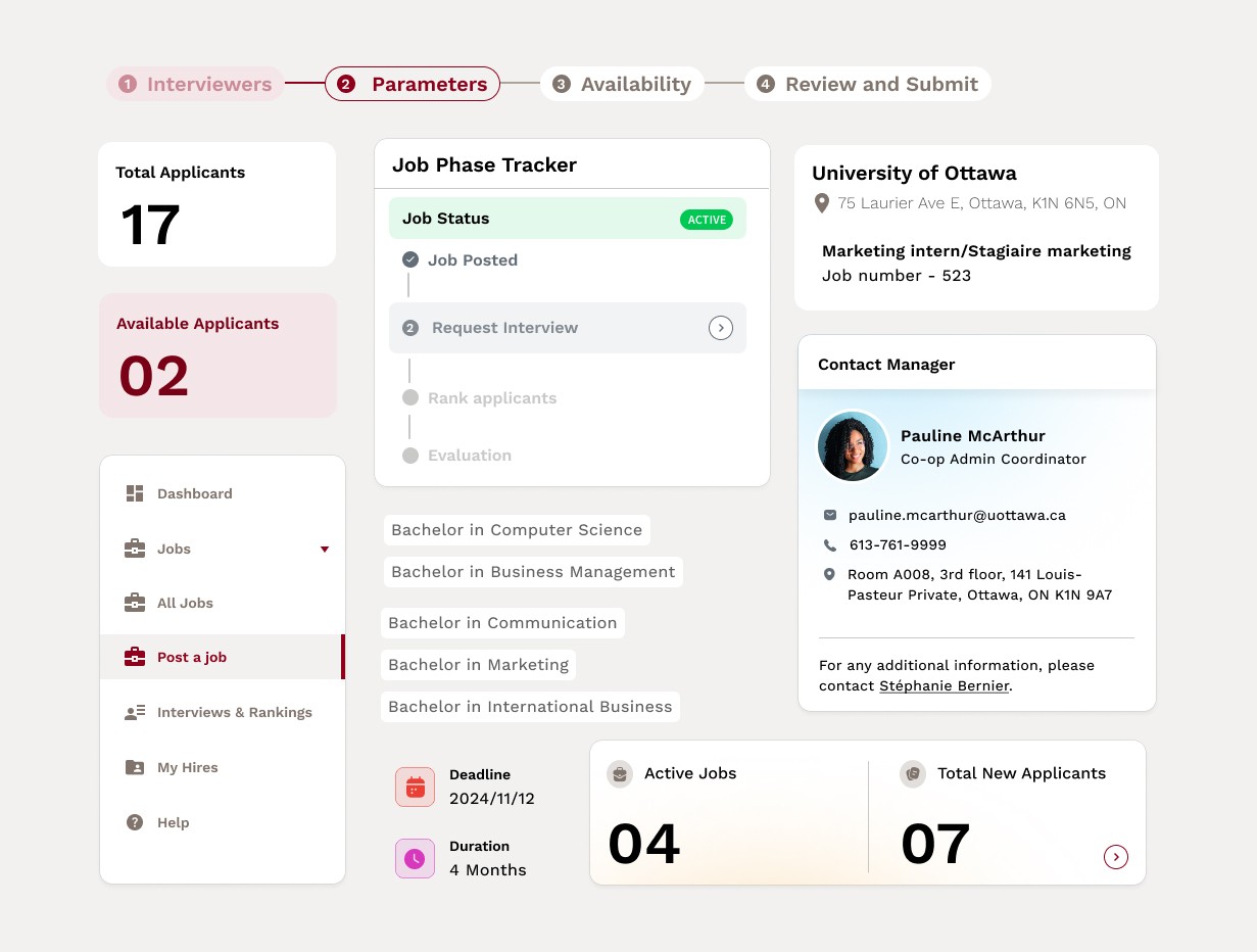
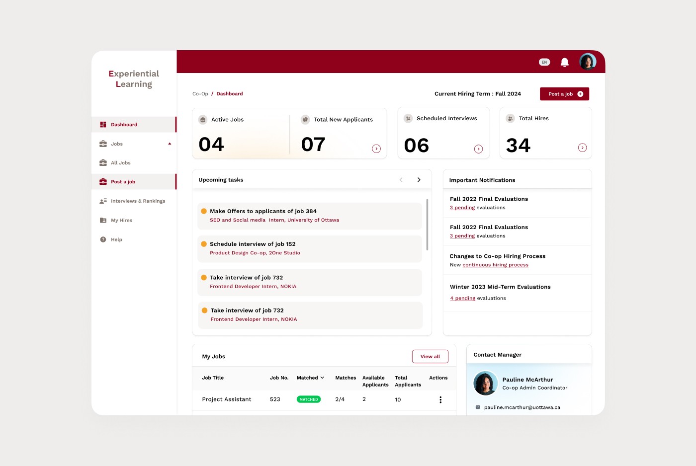
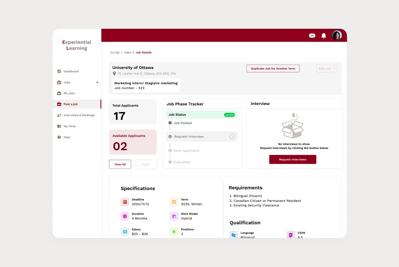
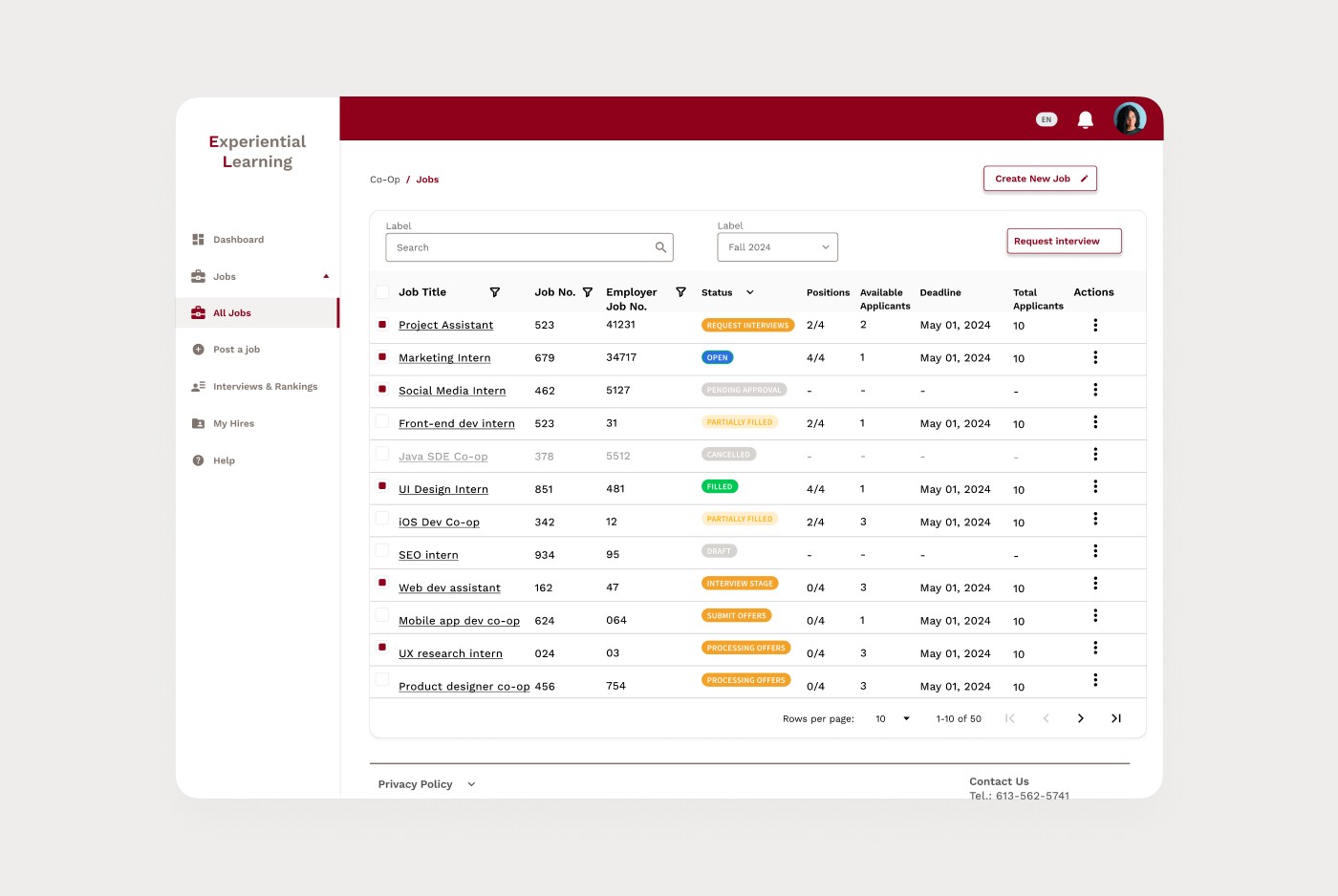
With those pieces ready, I began redesigning the employer portal workflows.
Instead of treating pages as isolated screens, I designed around tasks:
• Posting a job
• Reviewing candidates
• Ranking applicants
• Managing interviews
Layouts were simplified, visual noise was reduced, and primary actions were clearly separated from secondary ones. Job posting, for example, was reorganized into a guided flow that allowed employers to focus on one decision at a time instead of facing a long, overwhelming form.


Impact
40%
faster job posting time after restructuring the flow
35%
fewer navigation errors due to clearer hierarchy and consistency
28%
higher task completion accuracy in candidate review and ranking
Beyond metrics, the biggest change was behind the scenes.
For the first time, uOttawa IT had a shared design system that future designers and developers could build on without starting from scratch.

